May-Jun 2024 • Silver Icing
Building a Design System to Unify Scattered UI
I built the organization's first design system from the ground up. Defining visual foundations, codifying a comprehensive library of reusable components, and establishing consistent interaction patterns and state behaviours across every product surface. Using an existing UI kit as a visual reference point, I built a system from the ground up capable of handling real product complexity: validation states, responsive behaviour, edge cases, and developer handoff. The system became the shared foundation for designers and developers across web, mobile, and internal tools.
The Problem
Brand Guidelines Without a System
When I joined, we actually had brand guidelines and a UI kit from a graphic designer. Everything was well-documented, right down to the hover and error states.
But it was really just a reference sheet, not a working system. Since colours and type were fixed values rather than tokens, we had no rules for layout or usage to keep things consistent in our files. This forced us to make judgment calls for every edge case, eventually causing our screens to drift until the same error state looked different on every platform.
The team didn't need a new style guide. We needed a system that could actually carry our shared decisions forward.
Early UI guidelines documenting visual styles and component examples.
The Opportunity
A Rebrand Opened the Window
Then the CEO initiated a rebrand, which meant we were going to be touching every single screen anyway.
Repainting on a broken foundation would have just repeated our old inconsistencies in new colours, so I proposed rebuilding from scratch as a working system instead. This required an upfront investment of two months alongside my regular product work, but it was a necessary trade-off to stop the quiet costs of design drift.
The pitch landed, and what followed became the company's first real design system.
The Approach
A Rebrand Became the Rebuild
When the CEO initiated a rebrand, I proposed using this as an opportunity to rebuild our entire interface as a functional, working system instead of just repainting our old inconsistencies in new colours.
I started by auditing our existing products to see where patterns repeated, broke, or were being improvised, which defined exactly what needed to be standardized. From there, I used Atomic Design principles to build the system from the ground up:
Defined the foundations and basic components first
Identified reusable patterns before designing more complex components
Built higher-level patterns only after the building blocks were stable
The goal was never to follow a framework perfectly, but to build a system that was actually easy for the team to adopt, extend, and maintain. I collaborated with our front-end developers throughout, making sure every component was practical before anything was finalized.
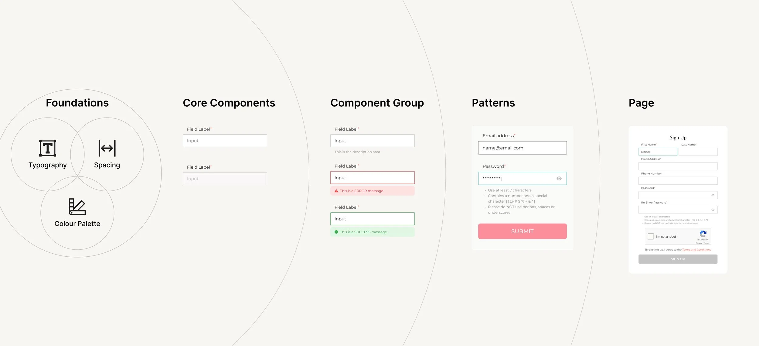
Example of how a single input component scales from foundations to real product usage.
The Solution
A Shared System Teams Could Actually Use
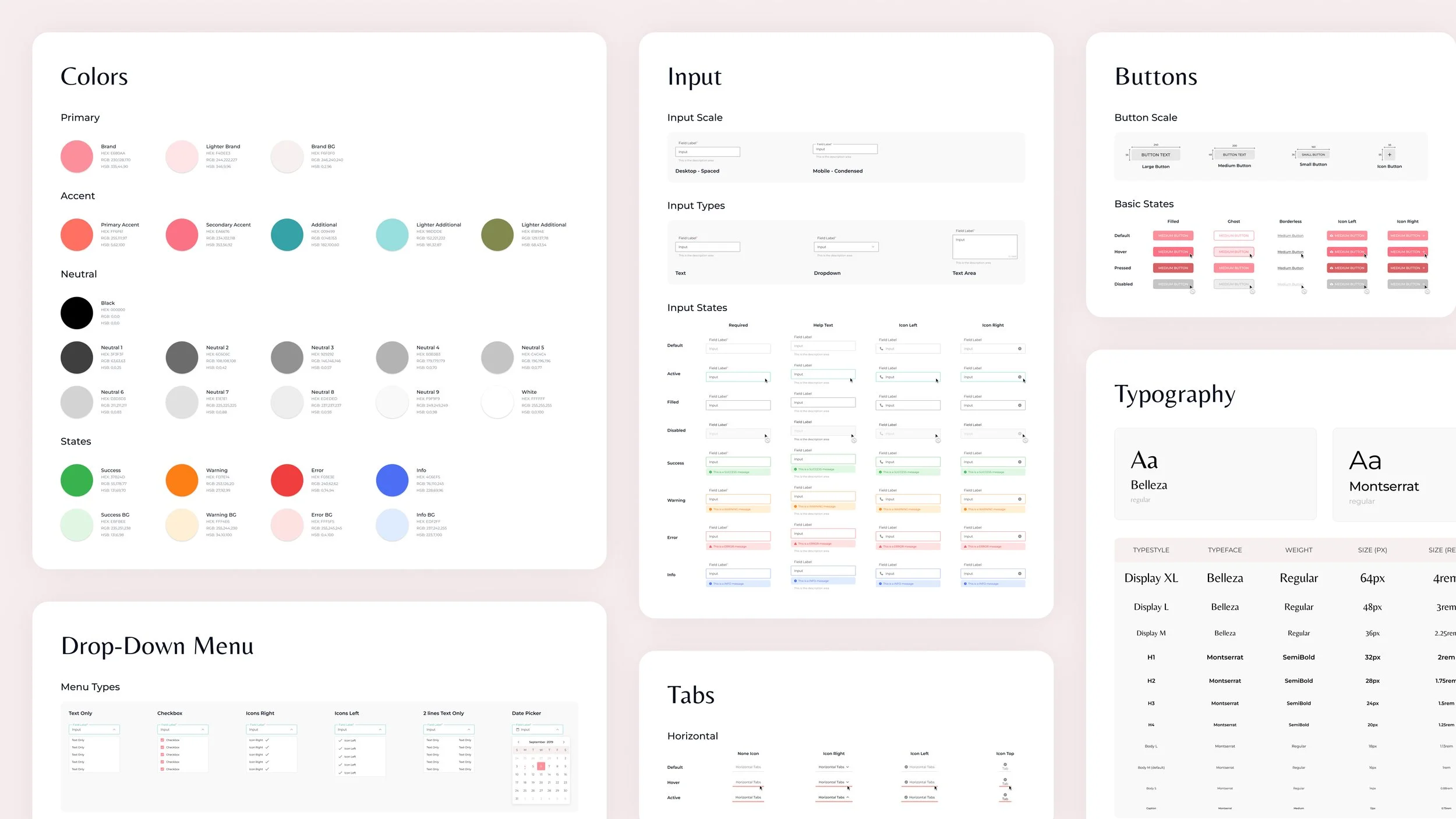
The result was the company’s first Design System, used across web, mobile, and internal tools. It standardized core interactions and visual foundations while remaining flexible enough for real product needs.
Brand Foundations
A unified visual foundation ensured consistency across surfaces and platforms.
Core Inputs
Core input components defined consistent interaction patterns for data entry, validation, and feedback across the product.
Navigation Patterns
Navigation components established predictable patterns for moving between content and actions.
System Feedback
Feedback components provided clear, consistent system responses for success, error, and in-progress states.
Utility Elements
Utility components supported labeling, filtering, and secondary interactions without competing with primary actions.
Components followed consistent interaction patterns and states (error, success, loading, disabled), reducing ad-hoc decisions, rework, and implementation ambiguity.
The system became a shared language for designers, developers, and stakeholders, helping teams move faster and stay consistent.
