Silver Icing
2024
Rebuilding Checkout to Launch Rewards Without Hurting Conversion
I redesigned Silver Icing’s checkout from the ground up, introducing guest checkout and a unified rewards experience. The new flow simplified how customers reviewed, paid, and applied rewards. After launch, reward usage rose 8% relative, with 4,454 orders using the newly introduced Points and Bonus Discounts in the first 16 months.
Background
How Checkout Worked Between Customers and Stylists
Shopping with Silver Icing wasn’t just about clothes — it was about connection. Most customers preferred buying through their Stylist, who made the process effortless with dedicated back-office tools. But when they tried to check out on their own, the experience fell short.

Early checkout flow confused shoppers with no guest option, poor hierarchy, and hidden credits.
When the company decided to introduce its first reward program, we saw a chance to redesign checkout into a transparent, trustworthy experience that made earning and using rewards effortless.
Discovery
Where Checkout Broke Down for Everyone
To kickstart the redesign, I benchmarked leading retailers to understand how they structure checkout and reward flows. The key findings revealed three essentials: clear visibility of discounts, instant confirmation when applying rewards, and consistent guidance through each step. These insights defined our approach for Silver Icing’s new checkout.

Key patterns from top retailers: visible rewards, instant feedback, guided flow.
I interviewed mature women aged 30–55+, Silver Icing’s core audience. They strongly valued personal service from Stylists but wanted the option to check out independently without confusion. Most described checkout as “a form I have to figure out,” often abandoning it halfway.

Insights from customer interviews (ages 30–55+)
The feedback from users indicated that while customers struggled to complete checkout, Stylists also felt uncertain about how rewards might impact their relationships and sales. Together, the research revealed a shared truth: people don't want complexity; they want clarity. Confidence comes from a flow that feels guided, transparent, and easy to trust.
Goal
Redefining the Flow for Clarity and Trust
Guided Checkout
Simplify the process into clear steps that reduce overwhelm and build confidence.
Transparent Rewards
Show value upfront so users understand what they earn and apply, building long-term trust.
Clear Feedback
Provide plain-language confirmations so shoppers know exactly what’s owed and what’s complete.
Approach
Designing a Step-by-Step Experience That Guides, Not Overwhelms
With these ideas in mind, I designed a checkout flow that put clarity into action.
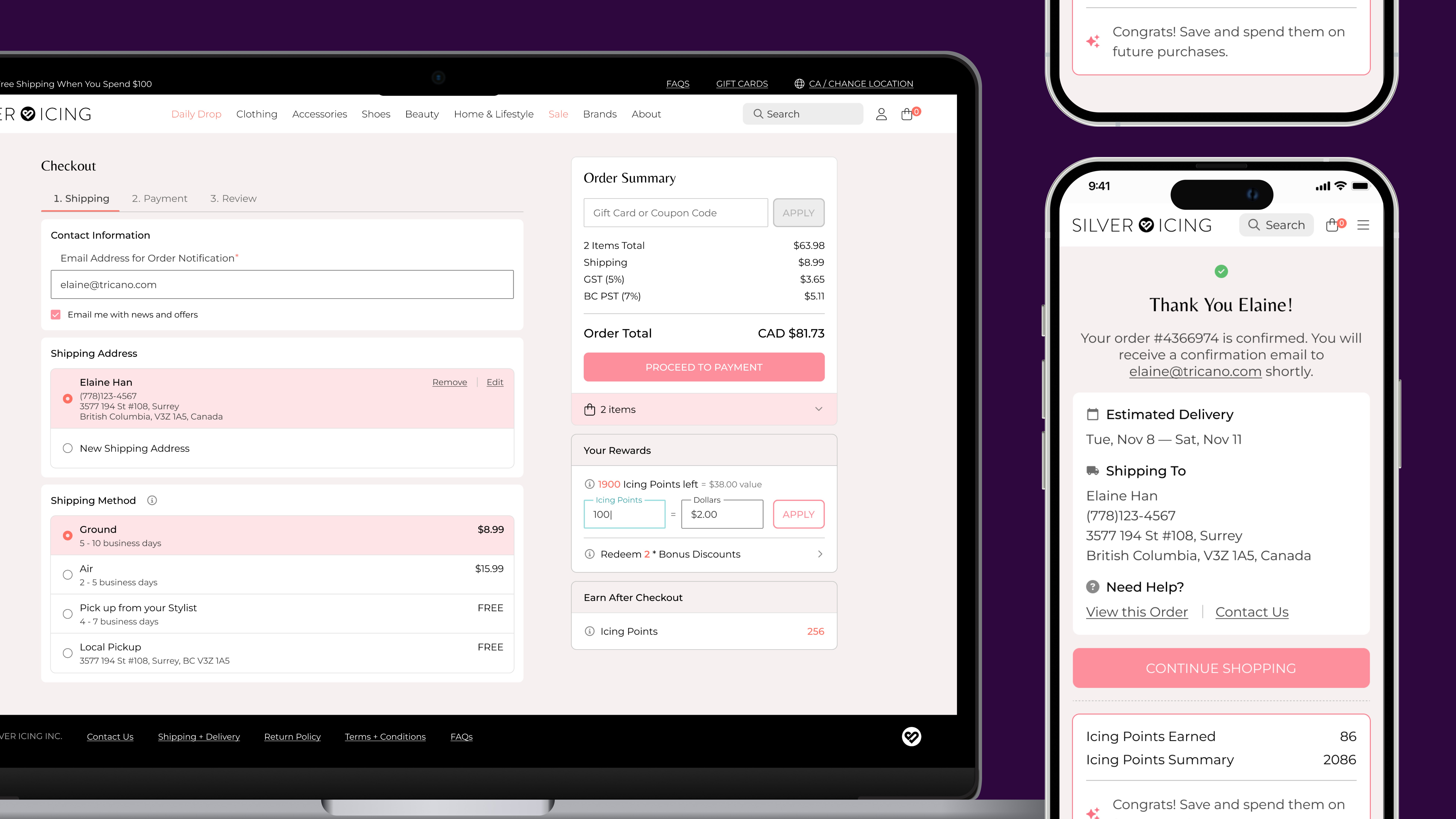
Each step—Shipping, Payment, Review—appears only when needed, creating a calm, guided rhythm. A live order summary stays visible throughout, giving shoppers constant feedback on totals, rewards, and progress.

Step-by-step checkout flow prototype with live order summary updates.
For new shoppers, the flow introduces choice without friction. They can sign in for faster checkout or continue as a guest, staying in control from start to finish. On the review page, a gentle reminder shows they can unlock rewards by creating an account, turning sign-up into a natural next step rather than a forced one.

Each step appears at the right time, guiding shoppers to sign in, pay, and unlock rewards confidently.
This approach turned sign-up from an obstacle into a moment of delight, encouraging first-time shoppers to stay connected while keeping checkout effortless and reassuring.
Design
Making Rewards Clear, Not Complicated
After simplifying the flow, our focus shifted to reward transparency, helping users understand what they could earn or apply at a glance.
Silver Icing introduced its first reward system with two types of rewards:
1. Icing Points
Earned from past purchases and applied directly to the order total at checkout.
2. Bonus Discounts
Earned from past purchases and applied to a selected product within the order.
Because each reward type varied by product category, it was nearly impossible for shoppers to calculate their savings at a glance.
I designed a unified reward summary that clearly shows how much customers can apply and earn, updating totals in real time. By surfacing rewards only when relevant, checkout now feels personalized, transparent, and easy to trust.
Innovation
FairClick: Bringing Fairness to Daily Drops
With checkout clarity established, our next challenge was the daily launch rush. The same principles of transparency and trust guided the creation of FairClick.
Silver Icing releases new products daily in limited quantities, often selling out within minutes. Stylists used to refresh their screens nonstop to secure presale items, turning each launch into a stressful race.
The video below shows how FairClick lets users pre-schedule orders ahead of launch. When products go live, the system automatically places them, creating a fair and stress-free experience.
FairClick in action: pre-schedule, relax, and let the system do the rest.
Originally built for Stylists and later opened to customers, FairClick brings calm and predictability to high-demand launches. To maintain transparency, I designed clear confirmation states for every stage, ensuring shoppers always know what’s happening and feel in control.

Displays each FairClick state: scheduled, unscheduled, and order placed successfully.
Impact
Clearer checkout, stronger reward adoption
The redesigned checkout brought payment, guest checkout, and rewards into one clearer purchase flow. Customers could see and apply their available rewards at the point of decision instead of navigating fragmented options.
After launch, the share of orders using rewards increased from 20.74% to 22.35%, a 7.8% relative lift. In the first 16 months, 4,454 orders used the newly introduced Points or Bonus Discounts, showing meaningful adoption of reward types that did not exist in the previous checkout.
The result was a checkout that supported new reward behaviors while making a complex purchase flow easier to understand and use.
+7.8%
relative increase in reward usage after launch, from 20.74% to 22.35%
4,454
orders used newly introduced Points or Bonus Discounts in the first 16 months
Reflection
From Options to Empowerment
Through this project, I learned the critical difference between offering options and providing empowerment.
The challenges of guest checkout and flexible rewards taught me that true user control comes from offering the right choices at the right time, not simply more choices. I focused on guiding users naturally, which meant meticulously designing for edge cases and mapping every possible error and success state.
These thoughtful details aren’t just polish; they’re what transform a functional flow into a confident one.


