Silver Icing
2024
Building a Design System to Unify Scattered UI
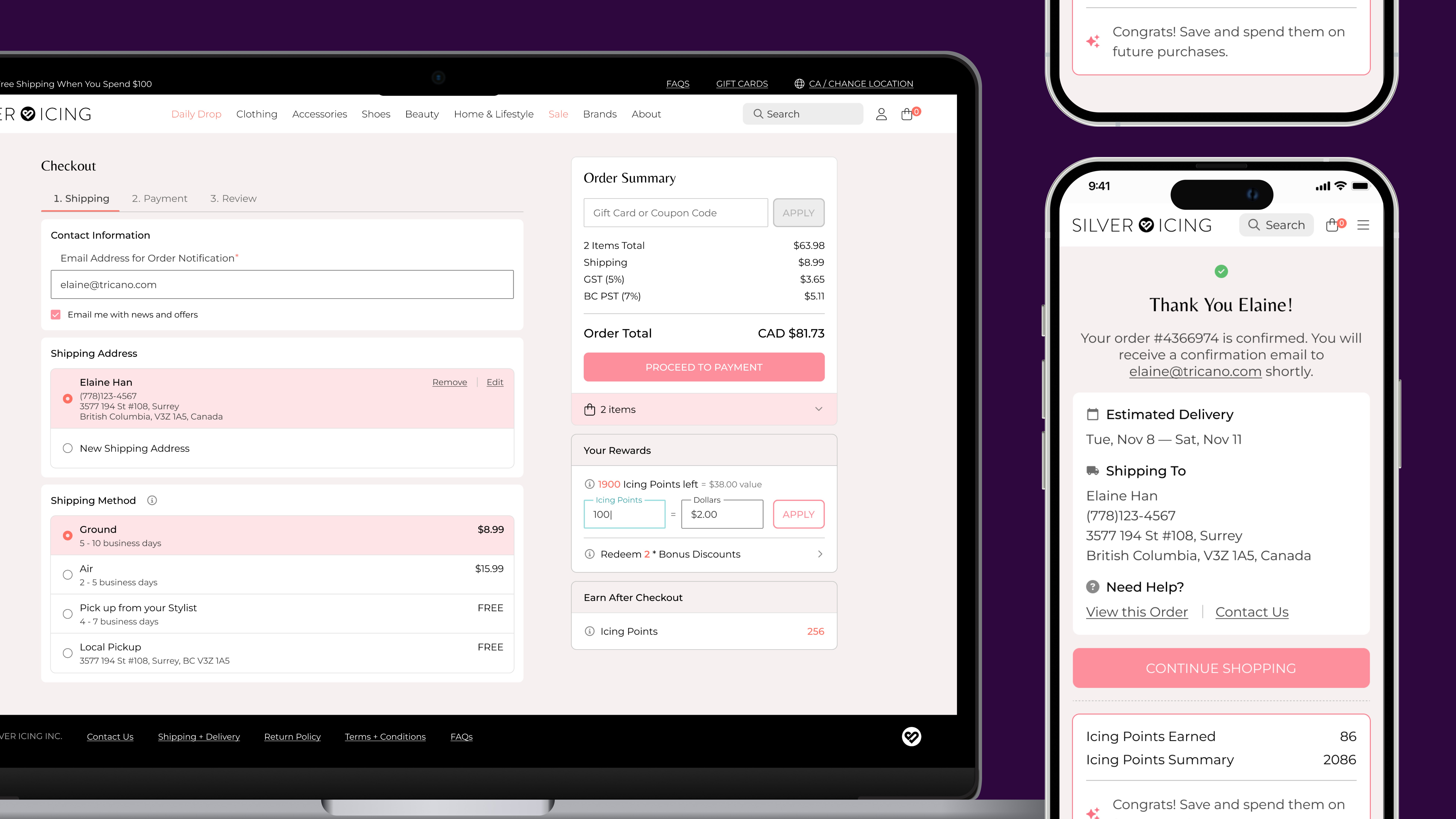
As the sole Product Designer at Silver Icing, I turned a static UI kit into the company’s first working design system during a company-wide rebrand. I standardized fragmented patterns and built 130+ reusable components across 19 families, creating a shared foundation that brought consistency across web, mobile, and internal products.

Problem
We Had Guidelines, but Not a System
As I worked across Silver Icing’s customer-facing commerce, Stylist tools, and internal operations, I started to notice that each product was evolving in a slightly different direction.
We already had a UI kit that documented the visual language, but it only existed as a static PDF. It showed examples of typography, colours, inputs, tables, modals, and other interface patterns, but there was no reusable structure behind them. That meant I was often recreating patterns or interpreting the same guidance again, while developers had to make similar judgment calls during implementation.
I realized the problem wasn’t that we lacked design direction. We lacked a working system that could keep those decisions consistent as the product grew.

The original UI kit gave us a visual direction, but not a system we could build with.
Opportunity
A Company-Wide Refresh Created the Moment to Rebuild
When Silver Icing began a company-wide rebrand, I saw the chance to fix the system problem instead of simply reskinning the same inconsistencies.
I proposed rebuilding the UI foundation in Figma while we were already revisiting screens across the product. It meant more upfront work alongside my regular product responsibilities, but it also meant we wouldn’t carry the same fragmented patterns into the new brand. By using the rebrand as the trigger, I could turn a visual refresh into a reusable foundation for future product work.
That decision expanded the project from a brand update into Silver Icing’s first working design system.
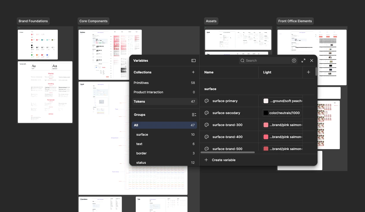
Instead of updating screens one by one, I rebuilt the foundation with shared variables, tokens, and reusable components.
Approach
Turning Existing UI Into Reusable Patterns
I started by breaking existing interfaces down into the decisions that repeated across products.
I separated foundations like colour, type, and spacing from reusable components, then grouped those components into larger patterns that could support real product flows. This helped me define what should stay consistent across the system and what still needed flexibility at the page level. Instead of designing each screen as a standalone solution, I could build upward from a shared set of rules.
The system became less about individual components and more about how those pieces worked together.

I built the system from shared foundations up to reusable patterns and complete product experiences.
Complexity
Designing for States, Variants, and Real Product Complexity
Once the core patterns were in place, I focused on the parts that usually break consistency: states, variants, and edge cases.
A component wasn’t finished just because the default version looked right. Inputs needed error, success, disabled, and focus states; buttons needed loading and hierarchy rules; more complex patterns had to adapt to different content and layouts. I built these decisions directly into Figma using variants and properties, so the expected behaviour was already defined before the component reached a screen or developer handoff.
That made the system useful for real product work, not just for documenting ideal examples.

Input states made validation and feedback predictable across screens.
Collaboration
Making the System Practical to Build and Maintain
I didn’t want the system to stop at a Figma library. It also needed to be clear enough for developers to build from and for the team to keep using consistently.
I documented how the library should be used, how variables and components were structured, and when different states or variants should apply. I also added interaction and accessibility guidance for patterns like buttons, inputs, tooltips, and modals, so developers didn’t have to infer behaviour from static screens. Keeping those rules alongside the system made handoff clearer and reduced the chance of new one-off patterns appearing during implementation.
The goal was to make the system usable without me having to explain every decision again.
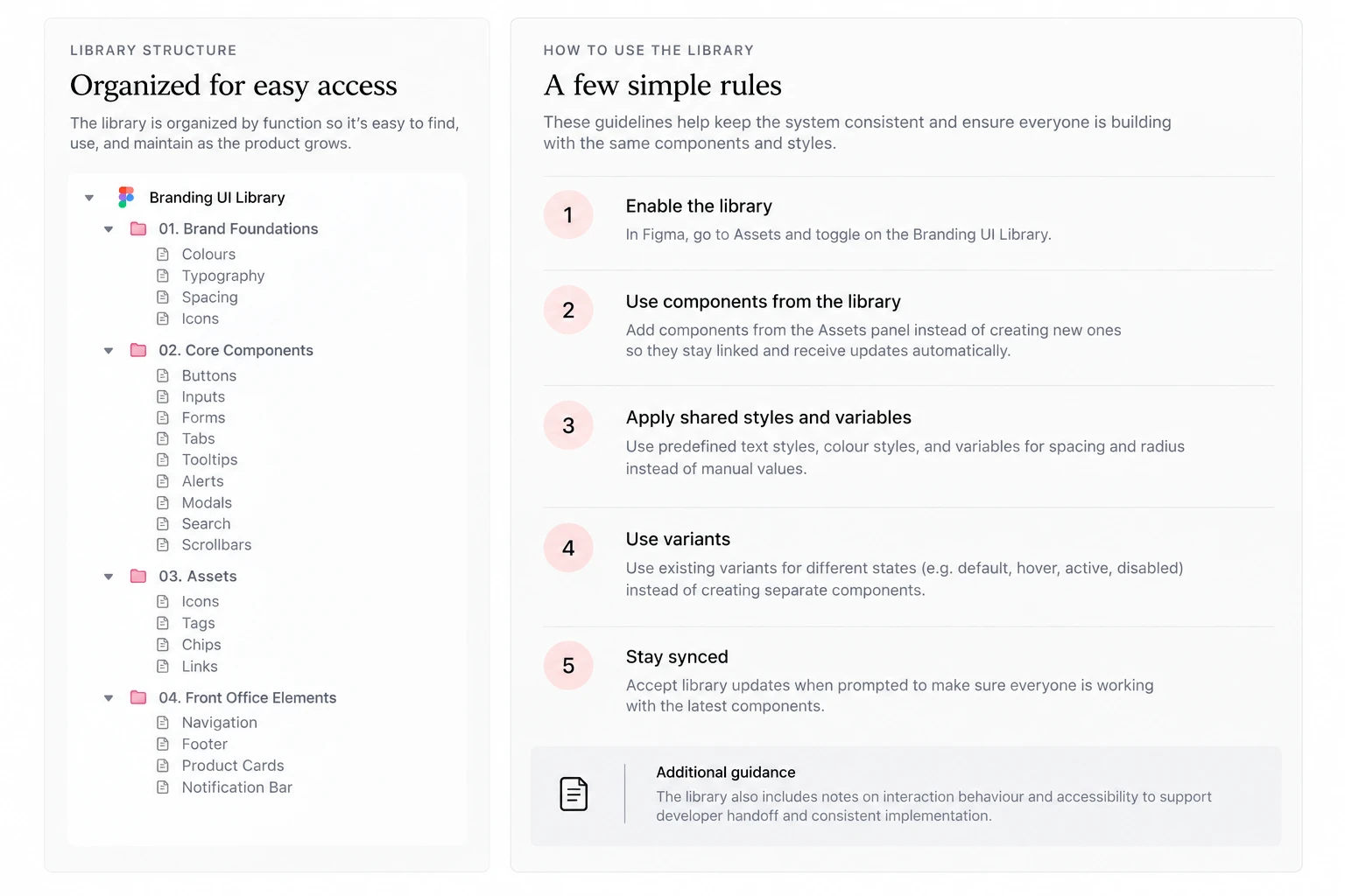
AI-assisted visual summary recreated from the original library structure and usage documentation.
Design
130+ Components Across 19 Families
What started as a rebuild of the foundations grew into Silver Icing’s first design system, with 130+ components across 19 families supporting web, mobile, and internal tools.
Foundations
I started by standardizing the decisions every product depended on, including colour, typography, and spacing, so everything built on top of them could follow the same rules.

Shared colour, type, and spacing rules gave every product the same starting point.
Core Components
From buttons and inputs to tabs, search, and feedback states, I built recurring controls with their key behaviours already defined, so they could be reused across products instead of being redesigned screen by screen.

Button variants standardized hierarchy, states, and common actions.
System Feedback & Utilities
Alerts, modals, tooltips, tags, and chips gave the team consistent ways to communicate status, context, and secondary actions across different workflows.
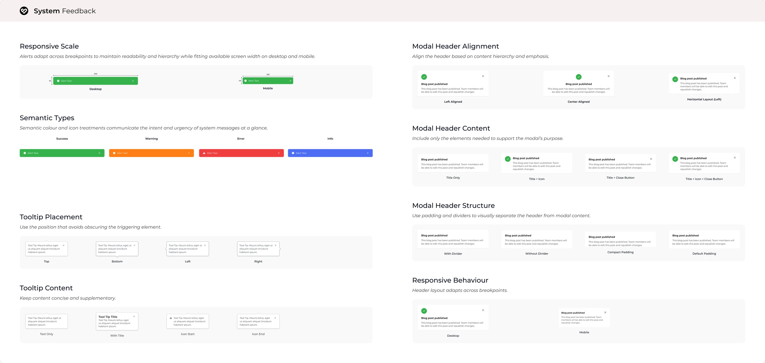
Shared feedback patterns for status, context, and focused interactions.
Product-Specific Patterns
For more complex elements like navigation and product cards, I built on the shared system without forcing every product into the same solution. These patterns reused the same foundations while staying flexible enough for different content and product needs.
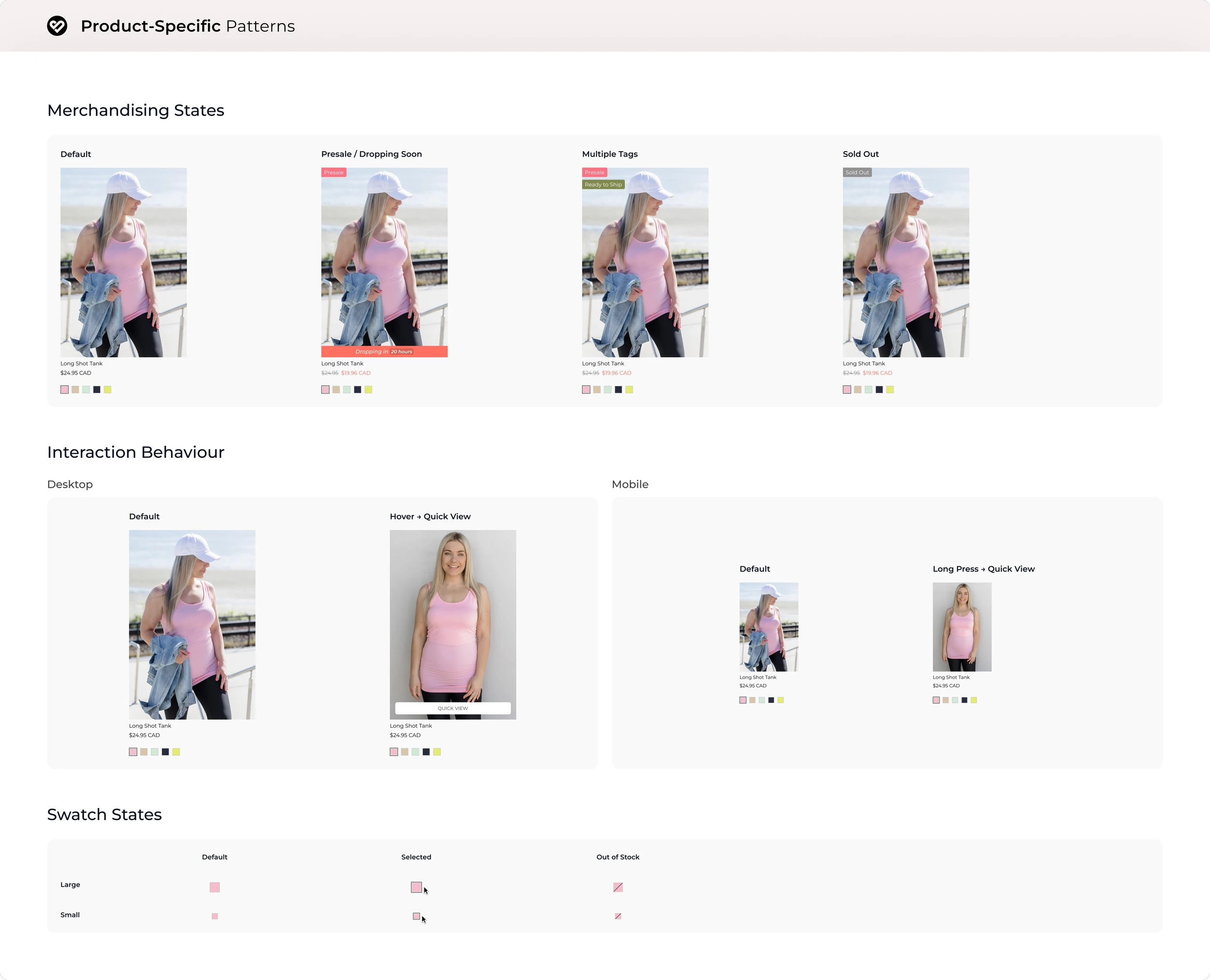
Product cards adapted across merchandising, device-specific interactions, and availability states.
The result was a system broad enough to support the platform, without turning consistency into rigidity.
Reflection
From Repeated Decisions to a Shared Foundation
The system changed how new product work started at Silver Icing.
With shared foundations, reusable components, and documented behaviours in place, I spent less time rebuilding familiar patterns and more time solving the problem specific to each experience. Developers had a clearer reference for how components should look and behave, which made handoff less ambiguous. Over time, the system became the default starting point across customer-facing, Stylist, and internal products.
Looking back, I learned that the real value of a design system is deciding which choices should only need to be made once.